Tuesday, 13 May 2014

evaluation

My media product uses a wide range of forms and conventions of real media product by my product using main events or main stories to help get the audience interested. Also the use of a celebrity as the main picture to show others the main focus of the media product which uses the same conventions of real media products. My media product also challenges real media products by using similar layout as well established media products to show the same understanding, but also to show the competition between my media product and real media products. The front cover challenges real media products by using techniques and similar layout to real media products which know which to attract customers and target audiences. The contents page challenges real media products by using similar information and surrounding which alerts people on the main focus of each magazine produced. The double page spread challenges real media products by taking the same layout and well established products, but to also make it easy to read and allow reading to flow.
My media product represents particular social groups by my media product containing information which would attract teens due to new upcoming stars who are coming rising up to be potential stars in the future. Also my media product attracts this particular social groups by using information which people are interested in seeing, giving them something to read about which they are into and enjoy reading. My media products front cover, contents and double page spread all represent particular social groups and the main focus of the magazine in Inda Birha a young individual who is becoming famous, which shows that others might be influenced in how he became famous and they might try the same or similar ways to get recognised, so it is seen a an influence rather than society making him out to be something he is not.
Media that will distribute my music product would be internet, radio, app stores. Internet would be used to distribute my media product due to young individuals using the internet on a daily basis which would allow my media product to be advertised which could interest others into buying the magazine. Radio stations such as Capital FM could distribute the product by promoting it to others and letting them know of my  media product. App stores would also distribute my media product by the app download which is available for others to download and read the latest news of the magazine and updates.
The audience for y media product would been teens from the age 15-25 due to my media product mainly being about young kids who are producing music with top record labels which people will enjoy listening to due to high expectations of the music. These would be the audience for my media product due to young individuals being interested in music and updates of which people are producing music. As my media products front cover, contents page and double page spread all include pictures of the 16 year old rap-star who has signed a deal indicated who the target audiences is as young males tend to listen to music from young writers and producers which have a meaning in which they can relate to their own lifestyle to help them get a better understanding and not too feel alone.
Audience is attracted by using big record labels and new signings to be visible on my front page, as young individuals who are interested in seeing who has signed a new contract and what new information is being spread. Audience is addressed by the people i have used on my media product such as ’Inda Birha’ which grabs the attention as they see a young male on the front of my media product. The front cover, contents page and double page spread attract the target audience by indicating on each page what the main focus of the magazine is, to give them stories and pictures of who/s music they should be looking out for as they are involved in music and new music which is being released. Target audience is addressed through the main pictures being on each page.
I have learnt the different techniques that technologies use to help construct a product in the order which I want, technologies such as internet, which allows me to get better understanding of the requirements of a media product, so I could achieve the same requirements in my own way making my media product reach established music magazines potentials. Also technology such as different software’s such as Photoshop, allow me to make my own design with what I would like to do to my media product. Technologies from my front cover, contents page and double page spread have been learnt that different types of software’s could be used in any advantage but the right software would help you produce and construct the product you like in the way you want it to be constructed

I have learnt from my preliminary task that the different aspects of how a media product is completed with the different use of research to give myself a better understanding of the different ways to how to produce my media product to my full potential. The preliminary tasks allowed me to get a good use of different software’s which gave me time to explore different techniques and find what is best for my full media product. My media products front page, double page spread and contents page all allow me to gain more knowledge and understanding on how magazines are made and the different thoughts that are given so that it attracts the target audience but also gives people the chance to read what they enjoy.

questionnaire results


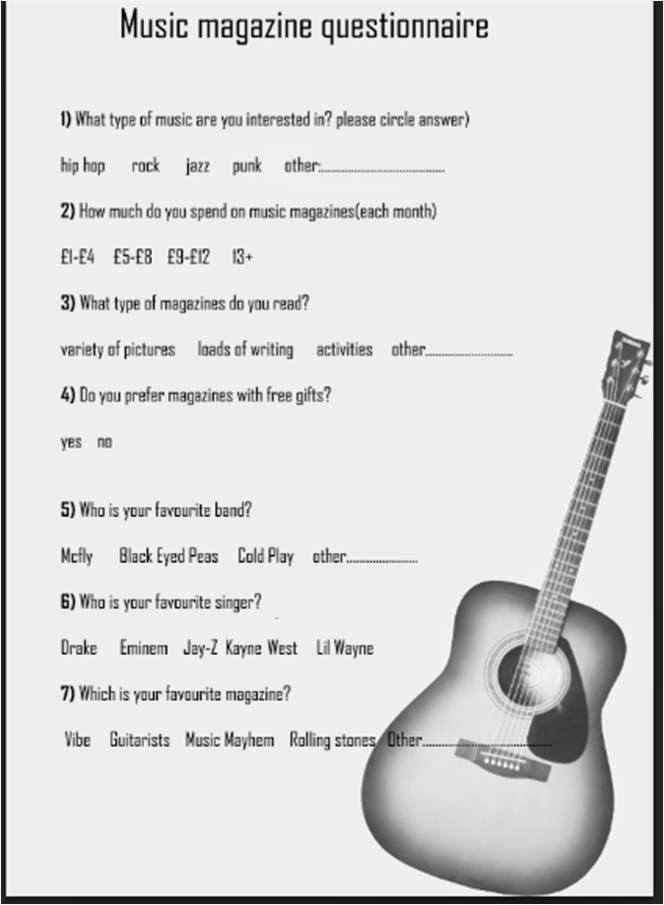
i produced my results from my music magazine questionnaire which was handed out to get feedback on magazine questions which i asked. the results were produced in charts to help me get a clear understanding and comparing answers to each other which allowed me to look into more detail and see for any patterns that might occur

music questionnaire final

for my final music questionnaire i got rid of the background and made it simple and easier for people answering the questionnaire to help get a better understand of what they expect to see in a magazine. also making visibility and stop colours and text contrasting due to the colours used for my background and the text colour.

music questionnaire draft

for my draft music magazine upon using my research it allowed to me to construct a ideal music magazine where i could use to help get information which was suitable for my magazine. due to colours being used as consistency i applied the same background here but was told not to used a background due to visibility of questions not being clear but also keeping it plain and simple for people to follow and see. the layout of my music magazine has been kept easy to follow and answer

music questionnaire research 2

I looked at this second music magazine to give me a further understanding of my music questionnaire. The colours used have been kept simple as no background has been added therefore black colour text has been used so it does not contrast with the background or writing. The layout of the questionnaire has been kept simple and easy follow by asking question by question on the left hand side with answers people could choose from but also are able to state their own interests. No image or graphics have been used in this questionnaire.

music questionnaire research 1

I looked at this music magazine questionnaire to help me get an insight of what type of questions I could use for my questionnaire. The colour used for this questionnaire has been kept simple due to the colour only black being used to indicate the text writing and the questions asked. The layout of the questionnaire has been kept simple due to order of the questions being kept consistent after each other, which allows audiences and people answering the question easy to follow. No images have been used in this questionnaire therefore no graphics have been used for the questionnaire.


double page spread final

for my final piece for my double page spread i used the feedback i was given to help me construct my double page spread the way i wanted it but also following the research i used to help me from a successful media product point of view. i listed text all upon one side of the page and used the other page to put a picture up so it is visible to all viewers on who the information is about. the background was changed to keep consistency of the colours used in the front cover and contents page

double page spread draft

using the 2 different double page spread as my research it allowed me to get a in depth knowledge of how double page spreads are produced, but also what type of information they include and the type of layout used in different double page spreads. the colours once again are bright and contrast with the writing therefore background colour and writing is hard to read due to bright colours used as the background. i was told to use the same colour for each different page to keep the consistency of the background and magazine colours.Also the layout is hard to follow due to information being spread out around the two pages to fill the spaces of the page. also told to put the picture allocated on either side so it is visible to others easily.

double page spread research 2

For my second double page spread, I looked at this of ’Elly White’ to give a understanding of what type of information and layout double page spread includes. The colours used are pink, white, green and black. The pink has been used as the background to make it attractable to the customer but also to make everything else on the page visible to others. The white has been used for the title and some text to stop it contrasting with the background. The colour green has been used to indicate the key words to alert people on the main key points of the double page spread. The colour black has been used for the text to stand out and not clash with everything else on the page. The layout has been kept easy to follow by the use of images kept on the right hand side and in the middle, which makes it visible and the layout easy to follow. The images used are of ‘Elly White’ to give people a insight of who she is. The graphics used have not been used well due to no editing of the pictures to help them blend in with the background, but have used to keep the background of the pictures which makes the scene of the picture apply with the picture.

double page spread research 1

I looked at this double page spread from the magazine ‘rapRadar’ to get a good understanding of what music magazine double page spreads include. The colours used for the magazine have been kept simple by using 4 colours. These colours are red, yellow, light blue and black. The colour red has been used to represent the letter ‘J’ in the middle of the page which is made to stand out from the writing, but also representing the artist they are interviewing (Jay Z) . The red has also been used on the writing on top of the artists picture to make it visible and easy to read for the audience. Half of the rappers face and half the background. The light blue has been used to represent the other half of the background to make the picture stand out. Yellow has been used to represent the logo of the music magazine so it alerts people who’s magazine they are looking at. The colour black has been used in the text to make it easy to read the layout of this has been simple and easy to follow, the image has been places on the left while the writing is on the right hand side. The image used is of a famous rapper/singer to show and indicate who the information is about. Graphics on this double page spread has been used well as the picture has been cut and edited well to blend in with the background.

final music mag contents page

i used the feedback given to help me produce my final contents page, i decided to keep the background colours the same as the front cover to keep consistency flowing through my magazine, the text for the heading as writing has been kept the same. i took on the feedback of changing the picture as it did not fit in the page so i used this photo which was edited to fade away within the background but yet the writing still standing out and visible for the audience

music magazine contents page draft 1

using the research i did for my music magazine contents page, it gave me a insight in what my music magazine should include. i produced my contents page draft to help get feedback in which i could use to help my contents page to be presented in the best possible way. the feedback was to again use different colours for my background due to the clash of red with the background and outline of my heading. i was told to use a different picture as it did not fit in with the page, the picture stood out more than the text and layout of the contents page. the way my information has been displayed as it is easy to follow for the audience

music magazine contents research 2

The second contents page I looked at was ‘Drummer’ to give me a good understanding of what a music magazine contents page should look like. The colours used are red and black. The red has been used to indicate main features such as the page numbers, the different pictures used to which are indicated on page numbers on the left hand of each picture. The read has also been used as a background to indicate what the page is. The black colour texts has been used to stand out from everything else on the page, but also to stand out from the white background and stop contrasting with the red text used. The images used on this contents page are pictures that are included in the magazine to give viewers a sneak preview. The image used in the centre of the page, which tells people that it is the main story of the magazine. The graphics used have been used appropriately as they are used well and show that they have been edited well and match the background of the magazine.

music magazine contents page research 1


I looked at this contents page for my first research to give myself a good idea of what i need to include and what my magazine contents page needs. The colours on this contents page have been kept to black and a shade of blue with red. The effect used is to make the light shade of blue and the red heart to emphasise the omens arm holding his heart into place. The text has been used in the colour black to not contrast with the background, therefore black text has been used. The layout for the contents page has been kept simple and easy to follow by using the picture on one side, and the text has been kept on the right hand side with the title ‘contents’ also being kept to the right hand side. The images that have been used in this contents page are of a famous rapper/singer which is well known and has a arm around his chest therefore indicates someone is holding onto his heart. The other image used is a ‘V’ which indicates the magazine name. The graphics have been used well as the picture has been edited properly and shows the picture matches everything on the page and the heart shaped has been used properly by making it match with the picture and making it stand out from the rest.

final music magaine

using the feedback i was given by other candidates on how to improve my music magazine to achieve best potential and use it to match real media products. i changed the background to stop colours contrasting but also used the information in a onder which allows people to follow the music magazine easily and make it attractable to the target audience.

draft music magazine front cover

this was my first draft of my music magazine front cover. i used my research well to try and produce my media product to be as good as real music magazines to compete and get people interested in my product. what worked well for my on my first draft was the information on my page was used to full potential however the layout of the text was all over the place, i was told to move it around by putting it in order and easier to follow. the background colour contrasts with my headings outline therefore i was told to change the background colour to help everything else on the pag stand out. also to put my primary image in the center of the page .

edtiting of pictures i used for my music magazine cover


the image i used to was taken myself for my music magazine front cover. this photo was edited in Photoshop by using the quick selection tool which allowed me to cut around the image and discard the background to give me the finishing product of the picture with no background which was used to help use different backgrounds and for the picture to be used with any background colour i chose to apply.

music mag front cover research 2

For the second magazine I looked at a different type of magazine to the first, to gain a better understanding of what makes music magazines good and stand out. The second magazine I looked as was Top of the pops. The colours used on this magazine are pink, which is used for the masthead that indicates who the magazine belongs too and what type it is. Pink is used, as it is a bright colour that allows it to attract the audience’s eyes. Other colours such as purple have been used to indicate main features and events with the magazine that could attract viewer’s eyes. The use of images have been used well, due to the main picture which covers the front page, but also indicates what he main focus in this magazine is. Other images used are to match what the targeted audience tend to want to see (expectations).  The images consist of medium shot angles of famous celebrities used by the producers of the magazine. The graphics used and editing have not been used well due to images not being edited to match the background, such as the picture used upper left, which indicates the black background which stands out from the page.

music mag front cover research 1

The first music magazine I looked at was ‘vibe’. The colours used in this magazine are consistent colours such as red, blue and white. The red is used to make the masthead stand out from the page, the colour red has also been used to indicate the specific details in this magazine which would stand out to the audience and catch their eyes. The blue background has been used to bring out the effect of the main picture in the centre of the page; it rings out the main picture, which is used to cover most of the front page. The blue matches with the artist used on the front and his appearance. The colour white has been used on text and information, which is written on the front page to stop colours contrasting with each other and making the text easier for the audience to read. The use of imagery has been kept simple by using only one piece of imagery, which is the main focus, and part of the magazine, to show what the most important thing in the magazine is. Other picture consists of a barcode and an android scanner, which allows people to get the magazine digitally. The graphics used on the left hand side have not been edited properly due to the white background that is visible, to show it has not been edited but in fact stuck on.


school contents page final


School Magazine final