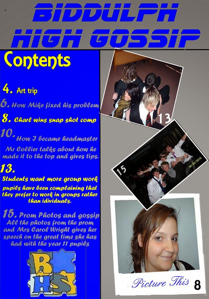
I looked at ‘Biddulph High School’ contents page to give me ideas on what a contents page includes. The colours used on this contents page are similar to the colours used in the school logo which is allocated at the bottom of the page. The colour blue and yellow have been used alternately to stand out, from each other, a dark blue background has been used on the left hand side to allow bright colours such as the yellow to stand out. The colour blue has also been used in the mast head ‘Biddulph High gossip’, to make it bold and be the first thing the viewers can see. However a lightshade of grey has been used on the right hand side and behind the mast head so the colours don’t contrast with each other, also to make the pictures and heading to stand out from everything else on the page. The pictures used are primary images which match the contents page by allocating what page more information and pictures could be available to attract the reader to read into the magazine. The other picture used is the school’s logo to indicate who the magazine belongs to and representing the school. However the graphic’s used are not used well due to when photo’s overlap they have not be edited or cut out, therefore some pictures are not visible in certain areas. Also the graphic’s such as the first image used tends to fall into the heading and the text used, which shows that is hasn’t be used properly or edited in the right way. The layout of the contents page is simple, the text is written on the left hand side and images have been used on the right, this shows consistency throughout the contents page.

No comments:
Post a Comment